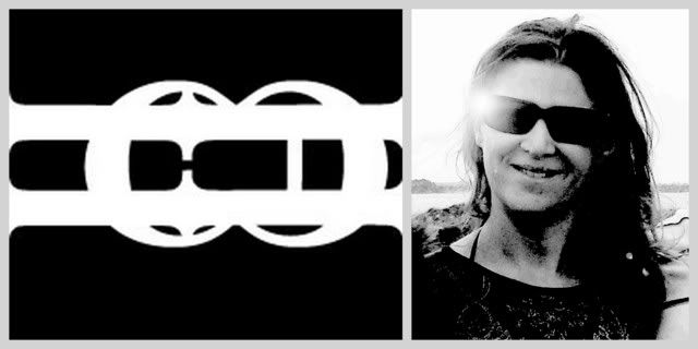
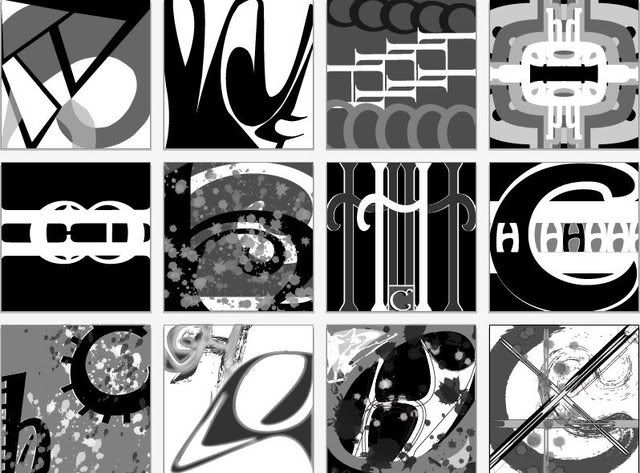
My last post was what I thought was my latest assignment for my class. Turns out (since I missed last class, which was supposed to be a working class or lab) the instructor modified the assignment.
Instead of blending a photo of your self with your initial she changed it to using elements (line, shape) of your photo with your initials.
I'm still not sure if I did it correctly; however, this is what I created.
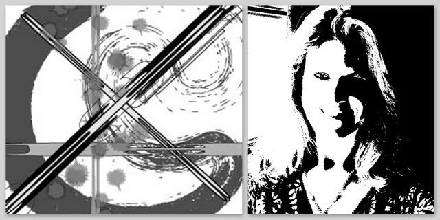
I started with a photo of myself. Edited it in photoshop by changing the appearance settings to black and white and adjusting the threshold. Then I imported the photo into Illustrator and used it as a template. From there I began to create a black and white, with gray scale, illustration.
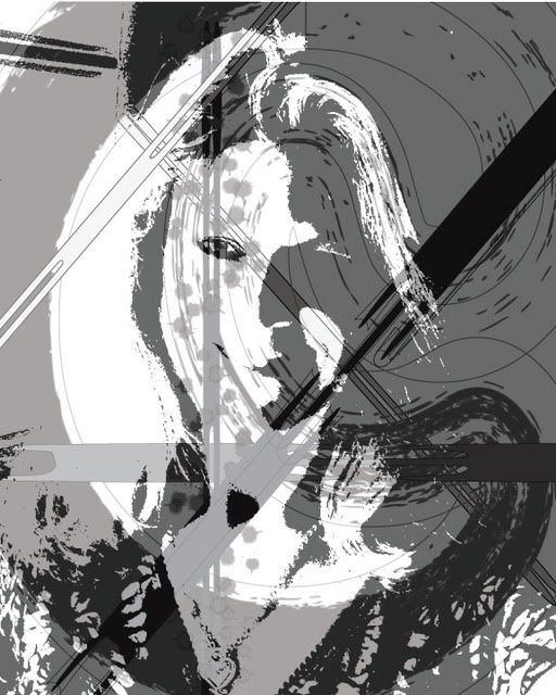
This is the first attempt/draft
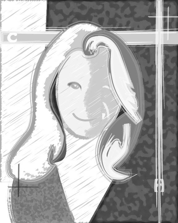
Then I began to simplify and edit my elements.
Here are the three final logos each one being edited from the previous one by saving as a copy in Illustrator and limiting my choices each time until the final design was simply a black line drawing on a white background. The goal was rely on as few lines as possible and to use implied line where ever it seemed to make sense.
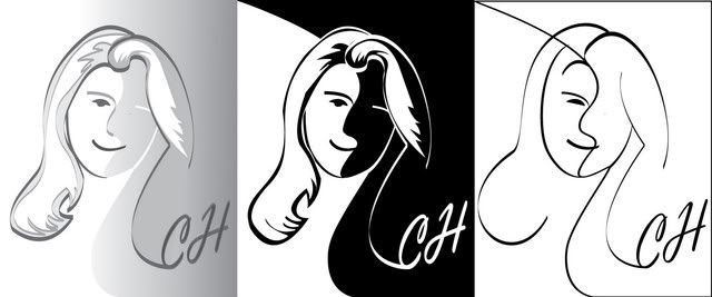
Which design do you think works best?

